CRM Client portal – redesign for web-based platform
The Brief
A client portal for insurance holders
The project’s goal was to redesign an existing platform (the client portal) where insurance companies communicate with their users. Additionally, the advisory side of the portal needed to be considered.
Personalized to the user’s situation
Users have the ability to fill out their situation and get relevant content in the form of articles. Moreover, insurance advisors can follow up on users’ action from the advisory side of the portal.
Design needs to be able to accommodate clients’ brand
One of the toughest requirements was to design in such a way, that any insurance company can show their own branding. Meanwhile, the platform needed to have a consistent look.
How to handle functionality overcrowding?:
The Methodology
As this was a redesign project, certain opportunities and constrictions applied. First, we had quantitative data on which pages were regularly used and which only occasionally. Next, the users were accustomed to using the current interface. After filling out a survey, they indicated that mostly they did not experience any frustrations. Therefore, the challenge was to observe their usage of the platform.
Methods used
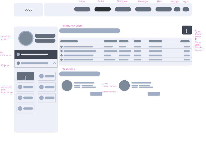
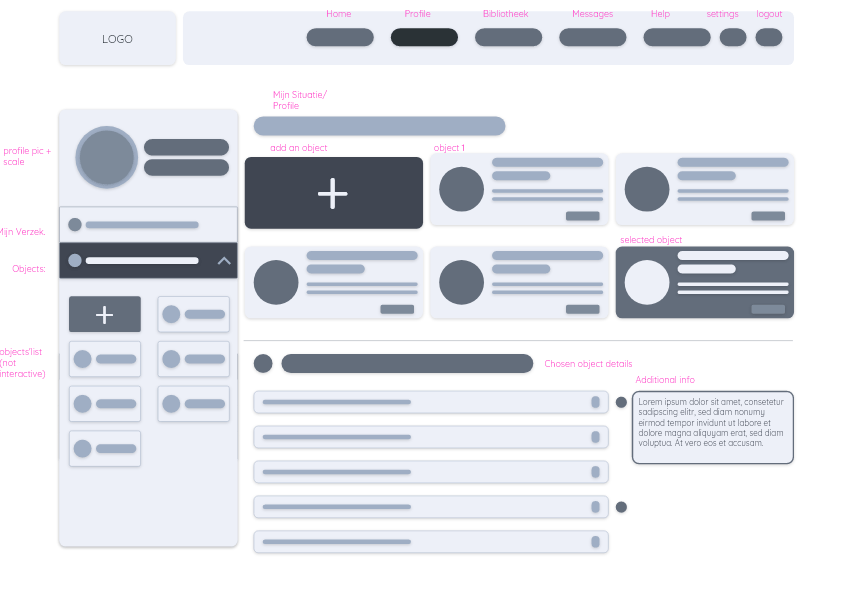
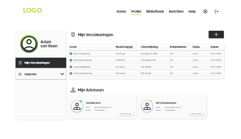
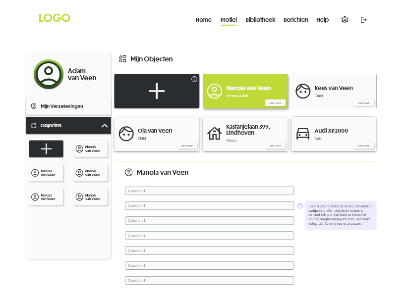
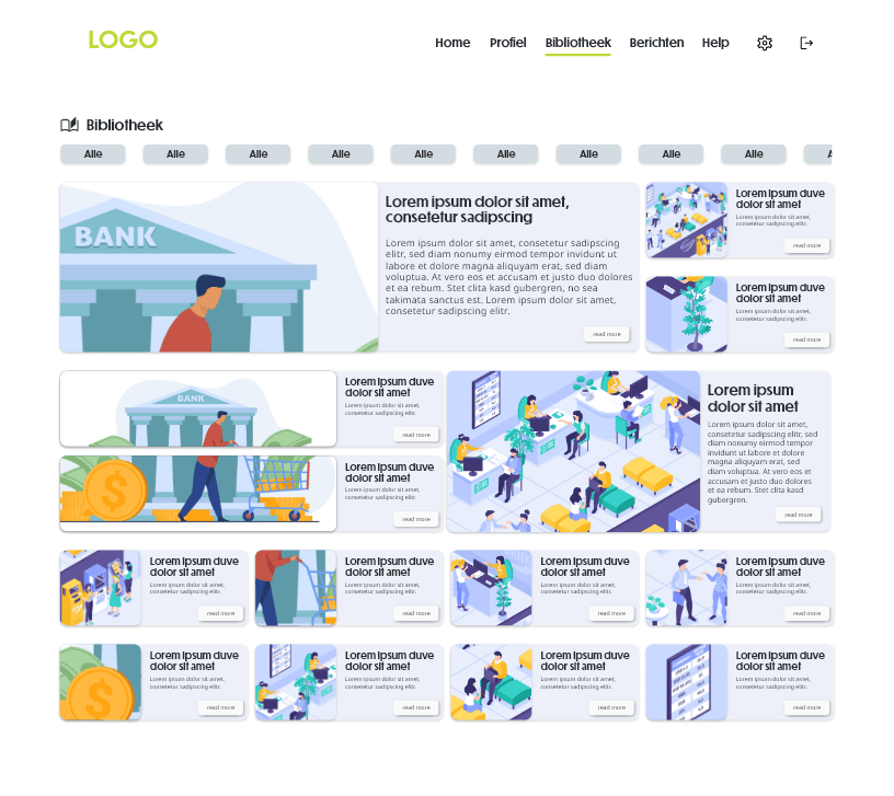
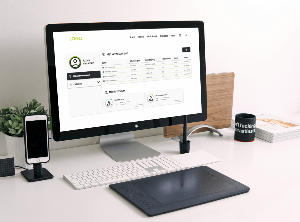
A huge bulk of the original functionalities had to take a step back. Therefore, creating space for the main focus points became the Profile, Library, Messaging and Help pages and content. In addition, that helped with users having a better overview of the system. During the testing phase, it matched with the mental model they have for similar platforms.
Wireframes
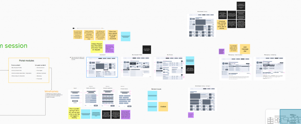
Creative session with stakeholders
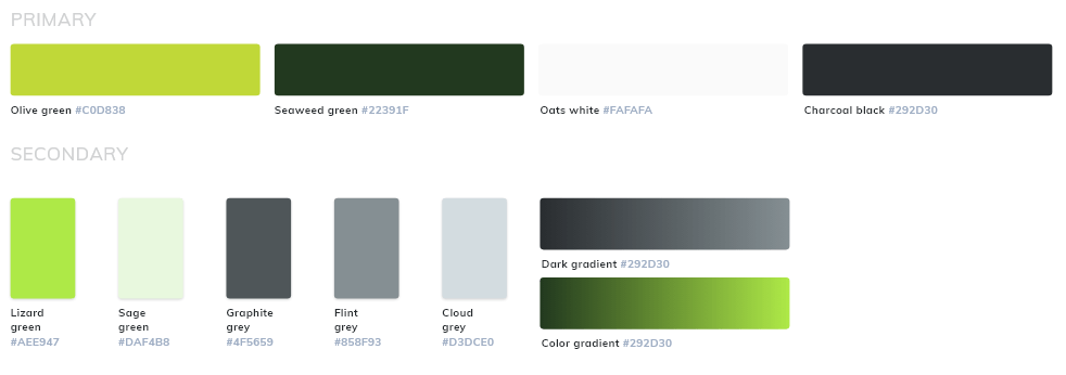
Accommodating to customers’ branding style
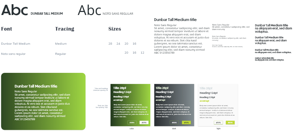
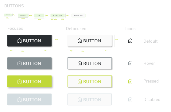
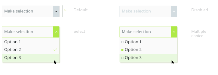
The design system was based on monochrome values which would potentially set in templates which the customers could choose from (or pay additionally for a personalized one).

